Creating a Mobile Friendly Website
Is your website mobile friendly?
Running the test
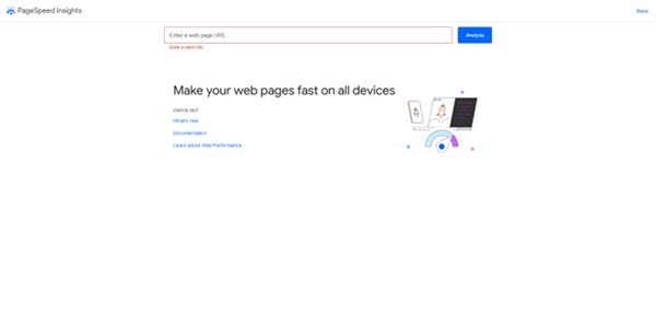
Being competitive in todays market requires your website to be mobile friendly. Many times you will hear the term responsive, mobile and responsive are interchangable terms when it comes to websites. You can test your website by going to Googles Mobile Testing website: https://pagespeed.web.dev/. This simple test allows you to have feedback from Google on what they see on your website. If you do have performance issues, save the feedback that Google listed so that you can start to correct the issues.


One common issue for a website is a piece of missing code that is positioned in the head of your website:
< meta name="viewport" content="width=device-width, initial-scale=1">
This tells the browser to render your website to the width of the device that is opening it up. Another common problem in Wordpress or other preformatted website creators is the theme is not mobile capable. In this case you have a few options. One is to pick a new theme. Second is to make the website mobile capable through changing the styling, which sometimes can be as easy as adjusting the css page, of the website. Third option is ignorin the issue, not recommended.
What the results mean?

Performance
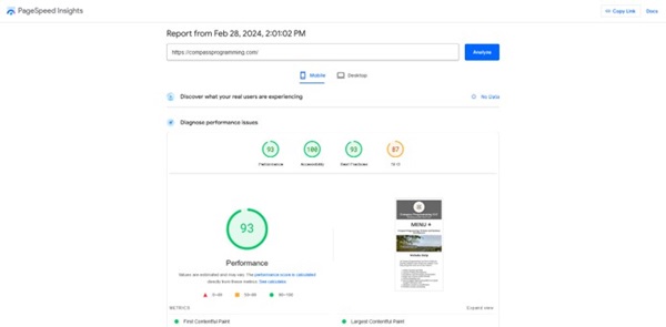
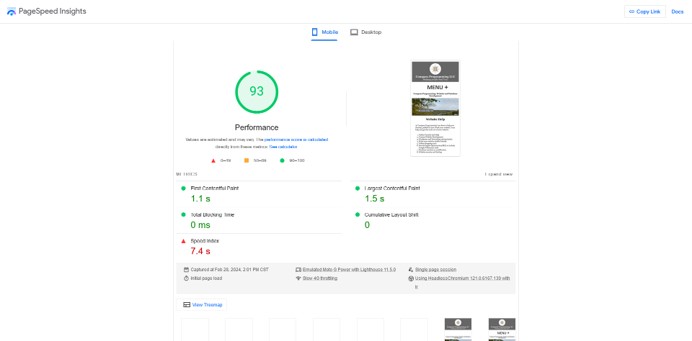
Performance tells you how well your website loads and is viewed by the public when they access your website. It has five metrics that are used to assist you in making your website more user friendly. Each section of the Metric gives you a good explanation of what needs to be corrected to improve your performance score.
The Google Documentation is clear that fixing one thing may not directly relate to a better score it is the correction of multiple things as a whole that increases the score. My advice is making the simplest changes first even if they will only speed up the website speed by a hundredth of a second. Sometimes that has a cascading effect leading to other items being processed faster because the one item was clogging up loading for another item. My biggest metric issue is my cascading style sheet (CSS). I am alright with the delay of it currently because everything else on my website loads quickly and a score of 93 is fine with me.
Accessibility
Websites need to comply with Americans with Disabilities Act (ADA) just like physical businesses. This means ensuring that everyone has the same access to the content of your website. At first this may seem to be an impossible task. Luckily there is a simple way to do this. The first thing to do is just follow the best practices for website creation by using all of the proper HTML practices available to you. A good source of information for all of HTML practices can be found at the W3schools HTML style guide, https://www.w3schools.com/htmL/html5_syntax.asp. You can also use this resource from WAVE web accessibility evaluation tool: https://wave.webaim.org/ to find a detailed list of issues on your website.
Best Practices
This will let you know if you are not following the best practices for images and code for layout. I am not following best practices for two images which I will have to correct in the future.
SEO
This will let you know if your web page is identifiable by search engines and understands what the website content means. In my case the search engine cannot crawl through some of my menu items because they are hidden until clicked. That means I get a lower score on mobile SEO versus the desktop version where the menu items can always be viewed. I do not feel that is going to hurt my SEO as it should be based more on the desktop appearance when search engines are reviewing a websites content.
Conclusion
If your website is not a Wordpress or other out of the box website and needs to be mobile friendly then it will need to be examined to see if the current website is formatted in a way to make it able to be mobile friendly. Older wesbites may be coded with such complicated tables and spans that create such a mess if modified it may be time to just reformat the whole website. Sometimes creating a new website and moving over the content to the new website will be the faster and better option. Typically the new website will have advances in code procedures and allow the website to perform better. One thing to look for is code in the css pages in your files, typically named style.css, like this:
@media screen and (max-width:730px) {
#mobile{margin:auto; width:90%; height:auto; text-align:center; }
}
What this is telling the browser to do is look at the screen size, in this case screens equal to or smaller than 730px wide. Change the css formatting for the assigned id's and classes. If you have some of these things in your code than you have some responsive formatting. Maybe you just need more added to become more responsive.
If you have any questions or comments feel free to contact me.
Last updated: 28 February 2024
 715-554-3224
![]() josh@compassprogramming.com
josh@compassprogramming.com
Saint Croix Falls, WI 54024
Compass Programming LLC all rights reserved 2024
Privacy Policy
